In this step you first add a Page node which shows a popup window with a door-open warning. Then you create a Toggle Button node which you use to toggle the blur effect and the popup window, so that when the warning is visible, the car node behind the warning is blurred.
Create the door-open warning
In this section you create a Page node which contains a door-open warning. You then set the page transition so that when the application navigates to the warning Page node, the warning fades into view.
To create the door-open warning:
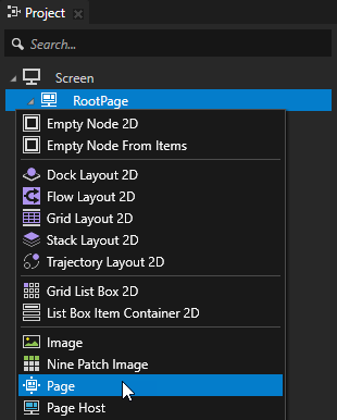
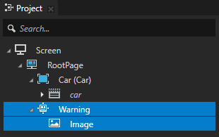
In the Projectpress Alt and right-click the RootPage node, select Page, name it Warning, and inside it create an Image node.
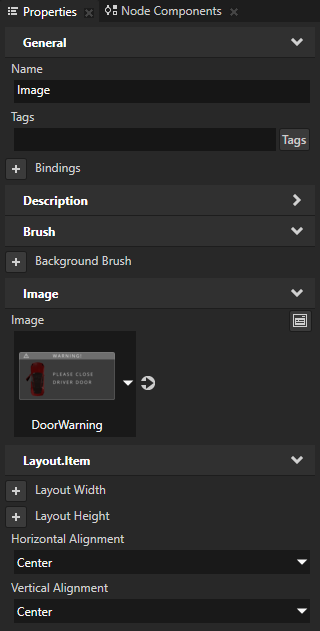
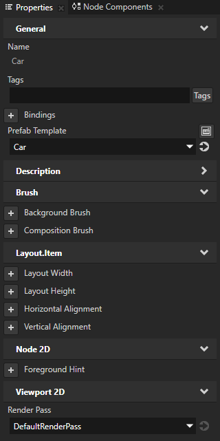
In the Project select the Image node, and in the Properties add and set:
Image to DoorWarning
Horizontal Alignment to Center
Vertical Alignment to Center
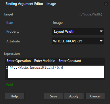
In the Properties add the Bindings property and in the Binding Argument Editor set:
Property to Layout Width
Expression to
{@../Node.ActualWidth}*0.6
You set the width of the Image node to be 60 percent of the width of its parent node.
Create the page transition to use when you toggle the door-open warning:
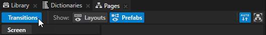
In the Pages click Transitions to show the Transitions editor.
In the Transitions editor in the Default Transition click to delete the default transition.
In the Transitions editor drag from the Transition Presets the Fade transition and drop it to the Default Transitions pane.
In the Fade transition click and set the Duration property to 200.
To see the transition in the Preview, in the Pages click the Warning node, then the RootPage node.
Toggle the blur effect and the door-open warning
In this section you create a Toggle Button node which you use to toggle the blur effect and the door-open warning, so that when you click anywhere in the application window the warning appears and Kanzi applies the blur effect to the Car node behind the warning.
To toggle the blur effect and the door-open warning:
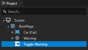
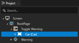
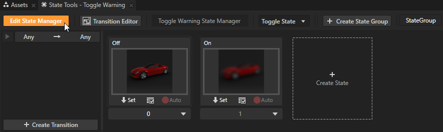
In the Projectpress Alt and right-click the RootPage node, select Toggle Button 2D, and name it Toggle Warning.
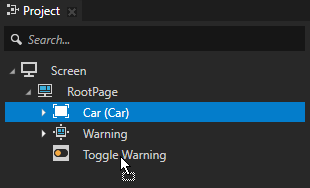
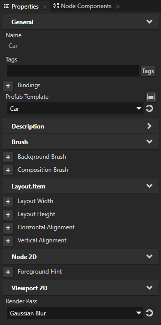
In the Project drag the Car node to the Toggle Warning node. This way you set the size of the Toggle Warning node to be the same as the Car node.
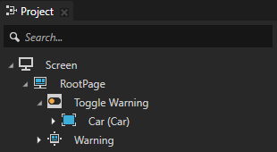
In the Project drag the Toggle Warning node above the Warning node. This way you show the Warning node in front of the Car node.
Configure the toggle button:
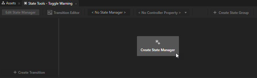
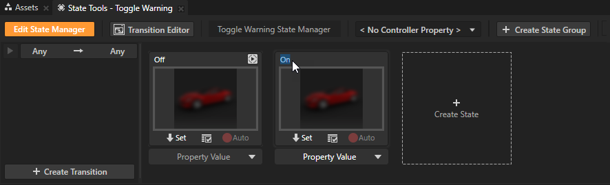
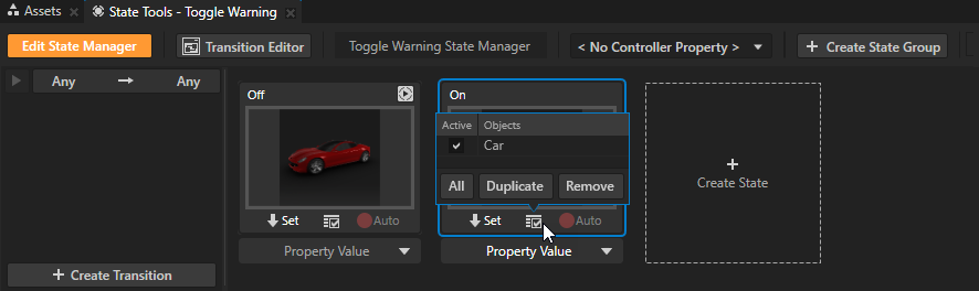
In the Project select the Toggle Warning node and in the State Tools click Create State Manager. Kanzi Studio creates a state manager and assigns it to the Toggle Warning node.
In the State Tools click Create State twice to create two states, double-click the name of each state, and rename the states to Off and On. You use the Off state to define the state of your application when the Toggle Warning toggle button is switched off, the On state when it is switched on.
Define the Off state:
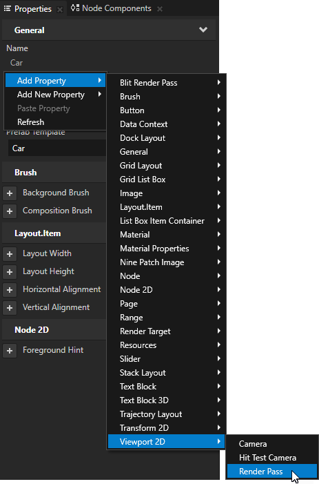
In the Project select the Car node, in the Properties add the Render Pass property, and set it to DefaultRenderPass. Here you set Kanzi to render the Car node so that the content is not blurred.
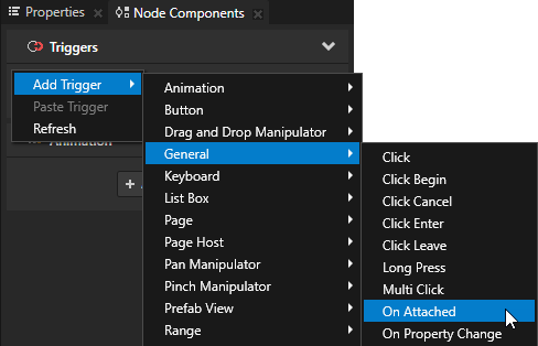
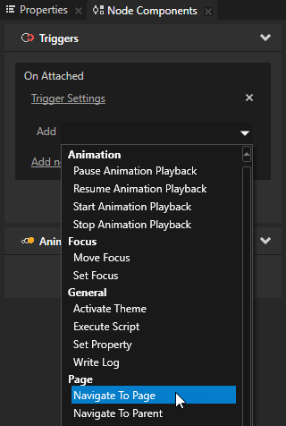
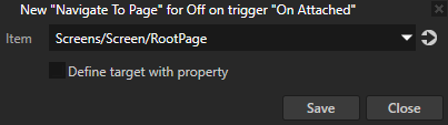
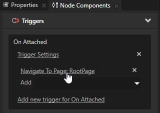
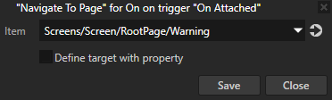
In the Node Components > Triggers section right-click, select Add Trigger > General > On Attached, in the On Attached trigger click the Add dropdown menu, select the Navigate to Page action, and in the action settings set the Item property to the Screens/Screen/RootPage node. Here you set the application to navigate to the RootPage node.
In the State Tools in the Off state click to save the current value of the Render Pass property and the On Attached trigger in the Car node to that state. You set Kanzi to render the Car node so that the content is not blurred, and to not show the door-open warning when the Toggle Warning button is in the Off state.
Define the On state :
In the Properties set the Render Pass property to the Gaussian Blur render pass. Here you set Kanzi to render the Car node using the render passes you created in the previous step of this tutorial, so that the content is blurred.
In the Node Components in the On Attached trigger click the Navigate to Page action and in the action settings set the Item property to the Screens/Screen/RootPage/Warning node. Here you set the application to navigate to the Warning node.
In the State Tools in the On state click to save the current value of the Render Pass property and the On Attached trigger to that state. You set Kanzi to render the Car node blurred and to show the door-open warning when the Toggle Warning button is in the On state.
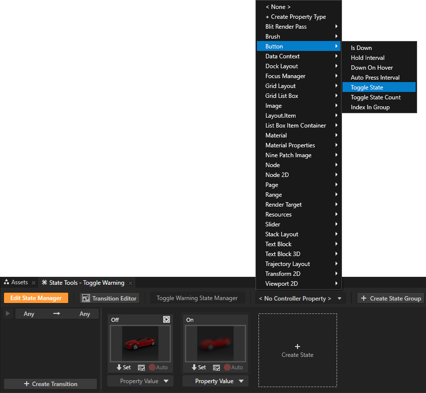
In the State Tools click the <No Controller Property> dropdown menu and select the Button > Toggle State property. In a state manager the value of the property you select as the Controller Property defines the conditions when each state in a state group is active.
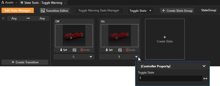
In the State Tools set the value of the controller property for each state.
For the On state set the value to 1.
For the Off state leave the value set to 0.
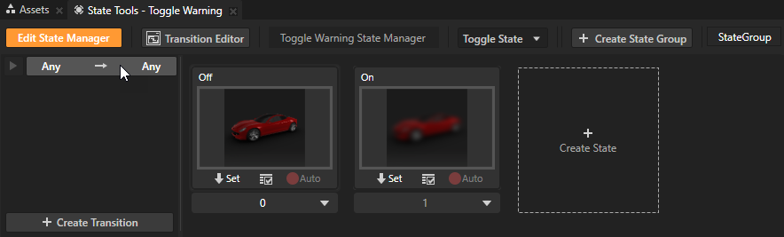
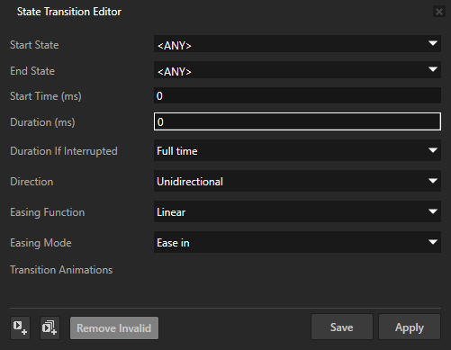
In the State Tools click Any -> Any and in the State Transition Editor set the Duration property to 0. This way you set the transitions between states to be instant.
In the State Tools click Edit State Manager to deactivate the State Tools.
In the Preview click to enter the Interact mode. When you click anywhere in the Preview window you toggle between the Off and On states you defined in the state manager you created for the Toggle Warning node:
In the Off state Kanzi uses the default render pass to render the Car node.
In the On state Kanzi blurs the Car node and shows the door-open warning.
 to delete the default transition.
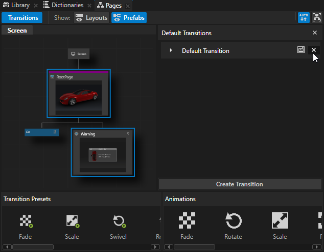
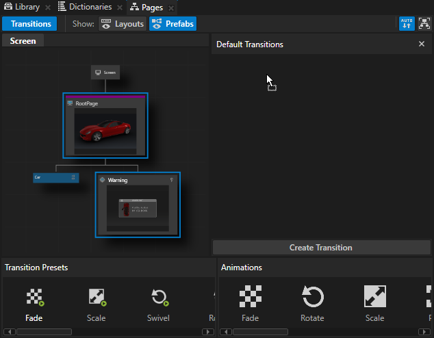
 and set the Duration property to 200.
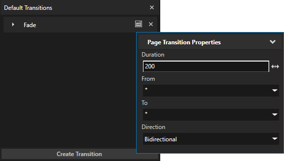
 to save the current value of the
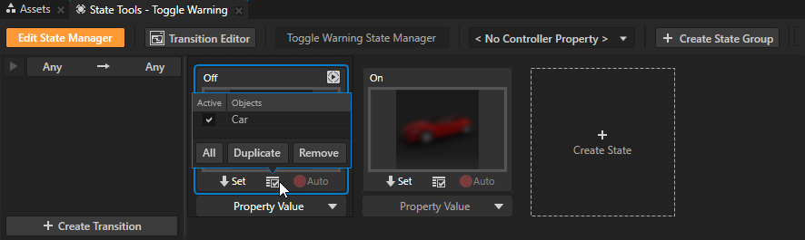
 to enter the